Factory spec sheet
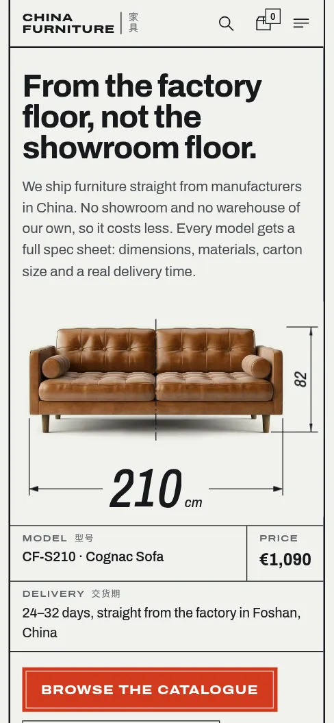
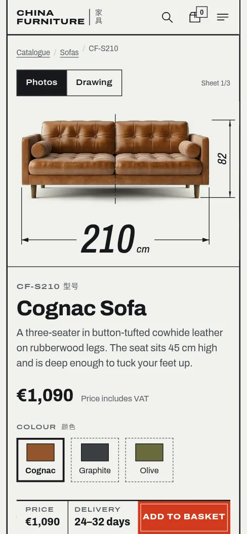
Picked by the rollEvery piece shown the way the factory sees it: measured, numbered, with its carton and delivery route. Instead of a catalogue photo you get a photo with dimension lines drawn on it.
- What sticks
- The sofa with a huge “210 cm” drawn on like a technical drawing. A red button like the seal on an order. Delivery time drawn as a dimension: 21–32 days from the factory next to 4–7 days from the EU warehouse.
- Why it could work
- It’s the most open about China and factory pricing, with no pretending to be a local workshop. Dimensions, cartons and delivery are the first questions anyone asks about furniture, and here they’re up front, e.g. “Will the carton fit through your door?”. It looks like nothing else in online furniture retail.
- Risk
- Too many lines and it turns cold, like documentation. The warmth has to come from the photos and the copy.
- Colours
Floor plan
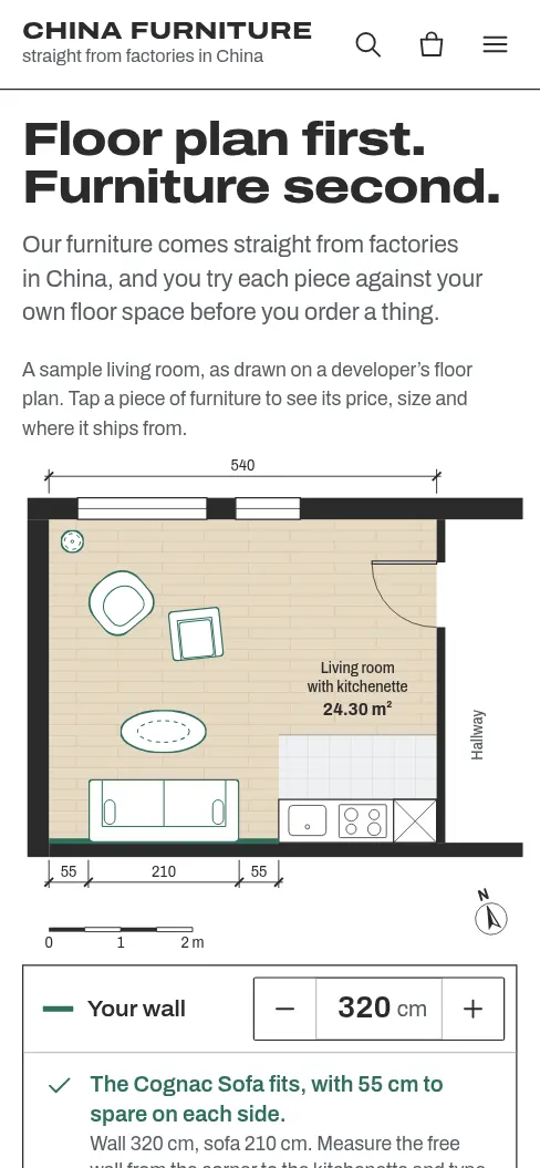
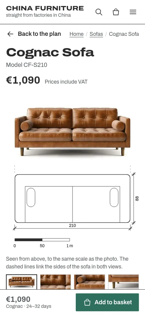
Top of my rankingYou buy furniture on the floor plan of your own home. Footprints sit to scale on a living-room plan, and the “Your wall” field shows straight away whether the sofa fits.
- What sticks
- A living-room floor plan like the one from the developer or estate agent, with the shop’s furniture standing on it at true scale.
- Why it could work
- It meets people at the exact moment they’re furnishing a new place with a floor plan in hand, and answers “will it fit?” before they ask.
- Risk
- The architect’s-plan look is a familiar trick, and on its own it says nothing about China or factory prices. The copy has to carry that.
- Colours
Category standard
Safe classicThe shop customers expect: a full-screen living-room photo, category tiles, a product grid. Done properly, at the level of Westwing or Kave Home, with no tricks.
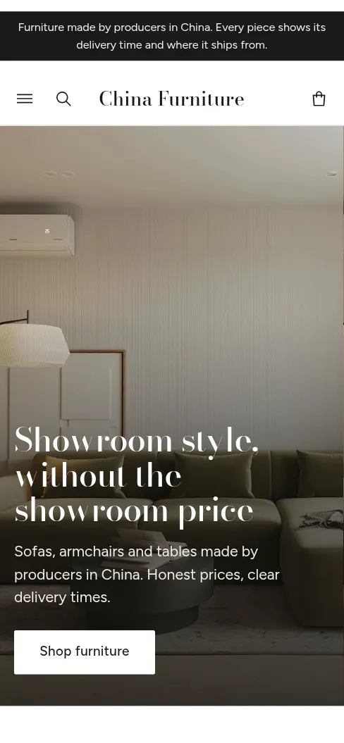
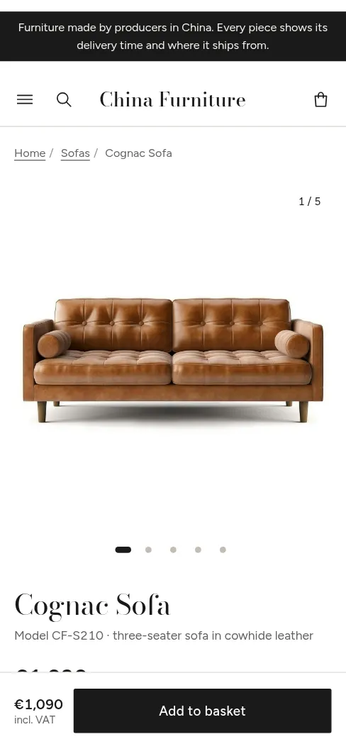
- What sticks
- Nice interior photos. Not much else, and that’s by design.
- Why it could work
- Zero learning curve: everyone knows where to tap. The lowest risk to start with.
- Risk
- It’s exactly the IKEA/Westwing clone you wanted to avoid, and it’s hard to stand out when plenty of others sell from the same factories.
- Colours
How to reply
- One letter: A, B or C.
- Or with a note, e.g. “A, but warmer” or “C, with the dimension drawing from A”.
- Or “roll again”, adding “safer” or “bolder” if none of them fits.
Once you choose, I build the whole shop in that direction: categories with filters, search, basket, checkout, order confirmation, plus Delivery & returns and Contact pages.
Directions rejected in the roll, and what A took from them
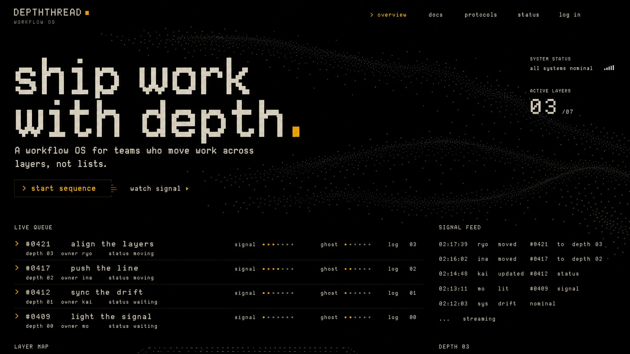 Demoscene cracktroNobody furnishing a flat sees themselves in a demoscene screen. A kept its rule that hierarchy is a single variable: line weight.
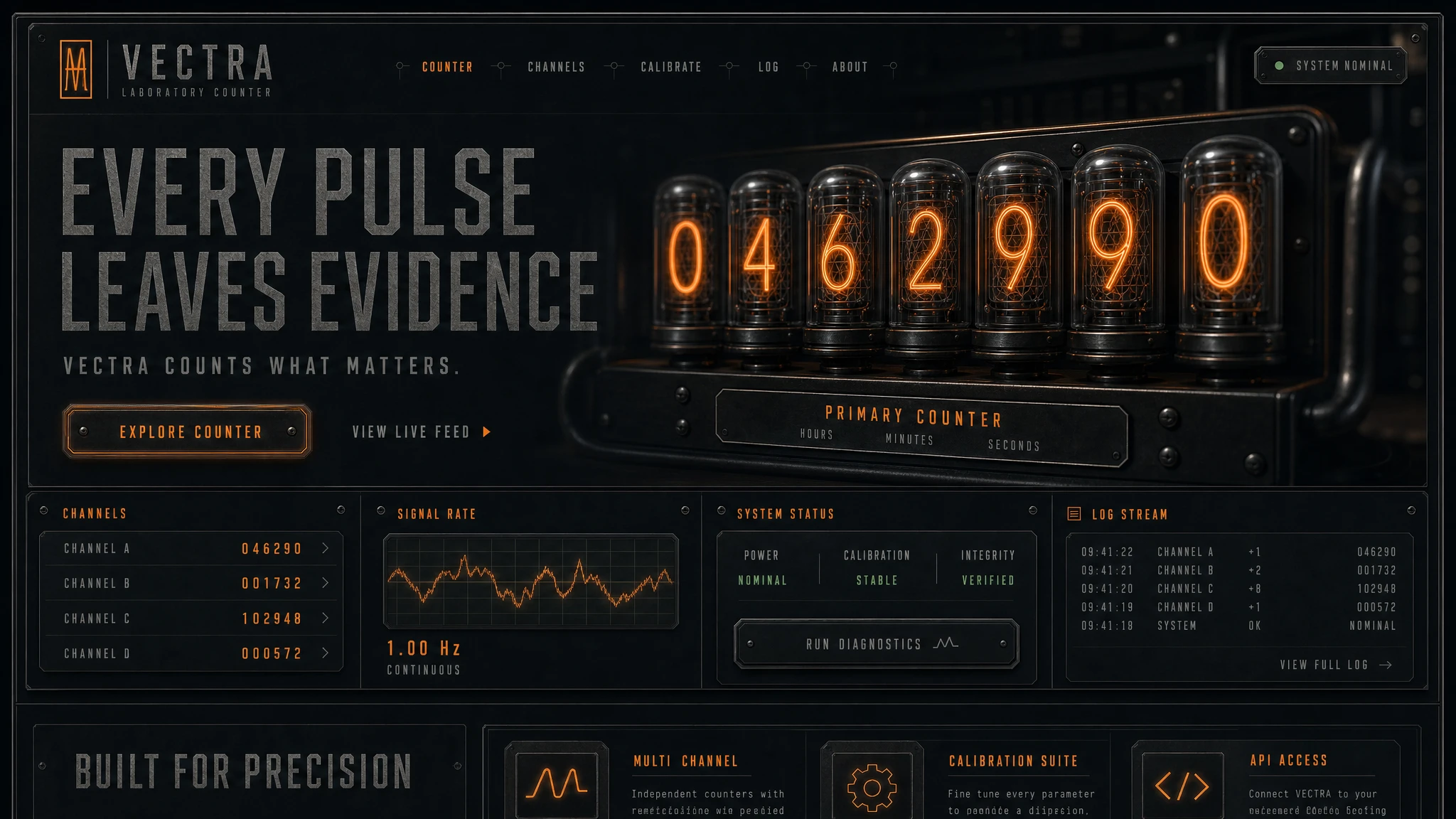 Nixie tube counterA lab panel drowns out the furniture photos. A kept fixed digit slots: a changed delivery time rolls digit by digit.
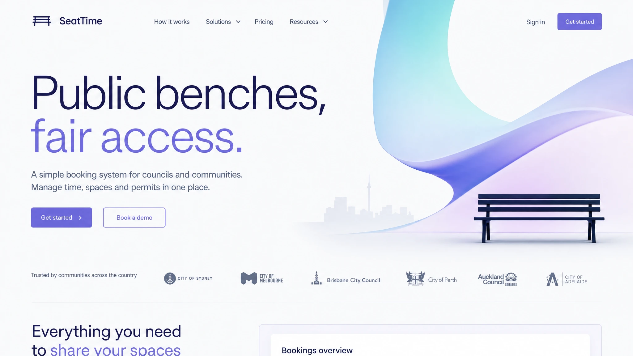 Civic bureau prospectusIt turns into a bank or a SaaS site. A kept its colour economy: red only on the main action.
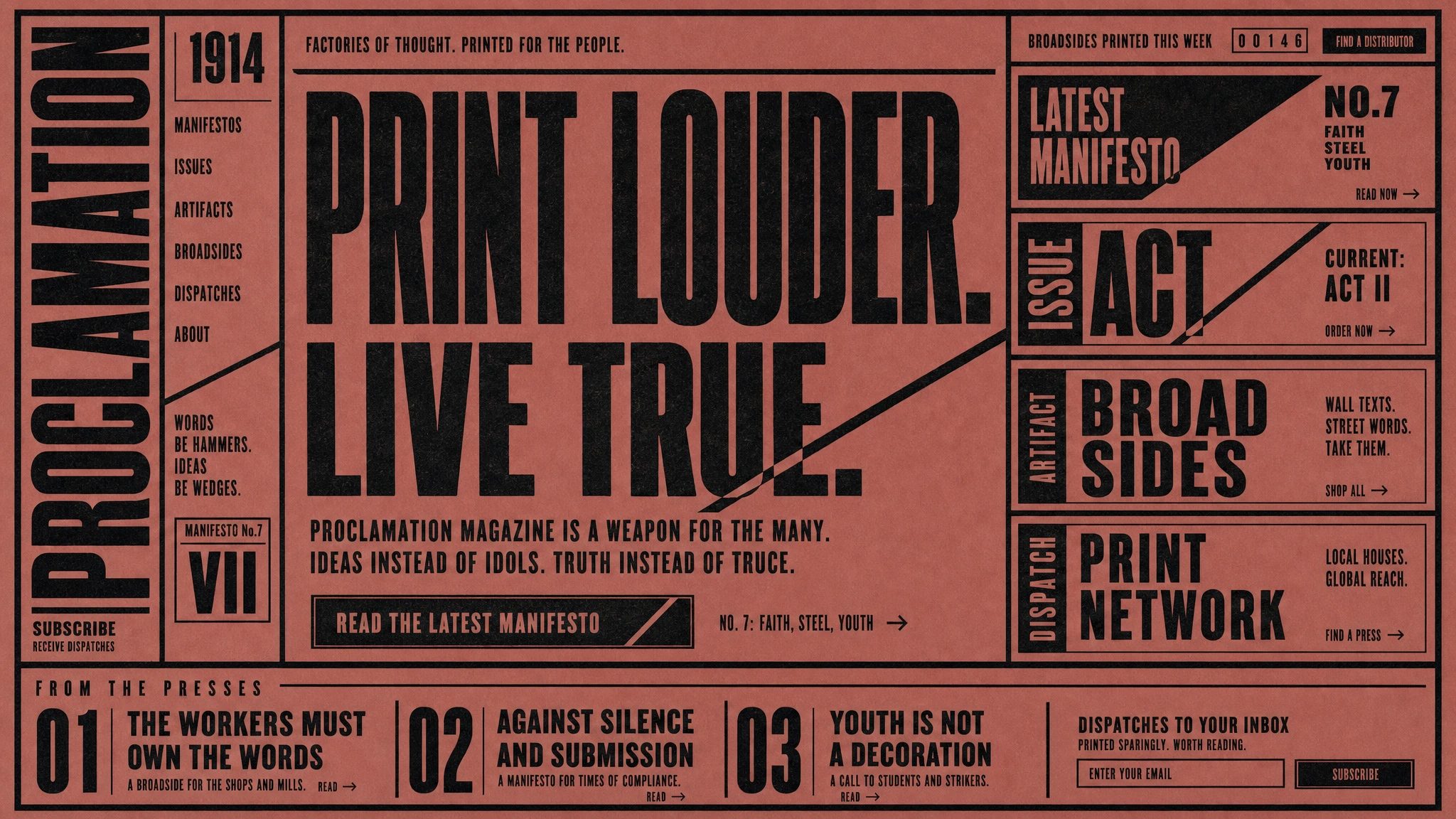 BLAST manifestoYou can’t buy furniture without photos of it. A kept the nerve to set a number at poster scale.
 Multiplane animationA fairy tale instead of a product. A kept two planes, photo and drawing, switched like a focus pull.
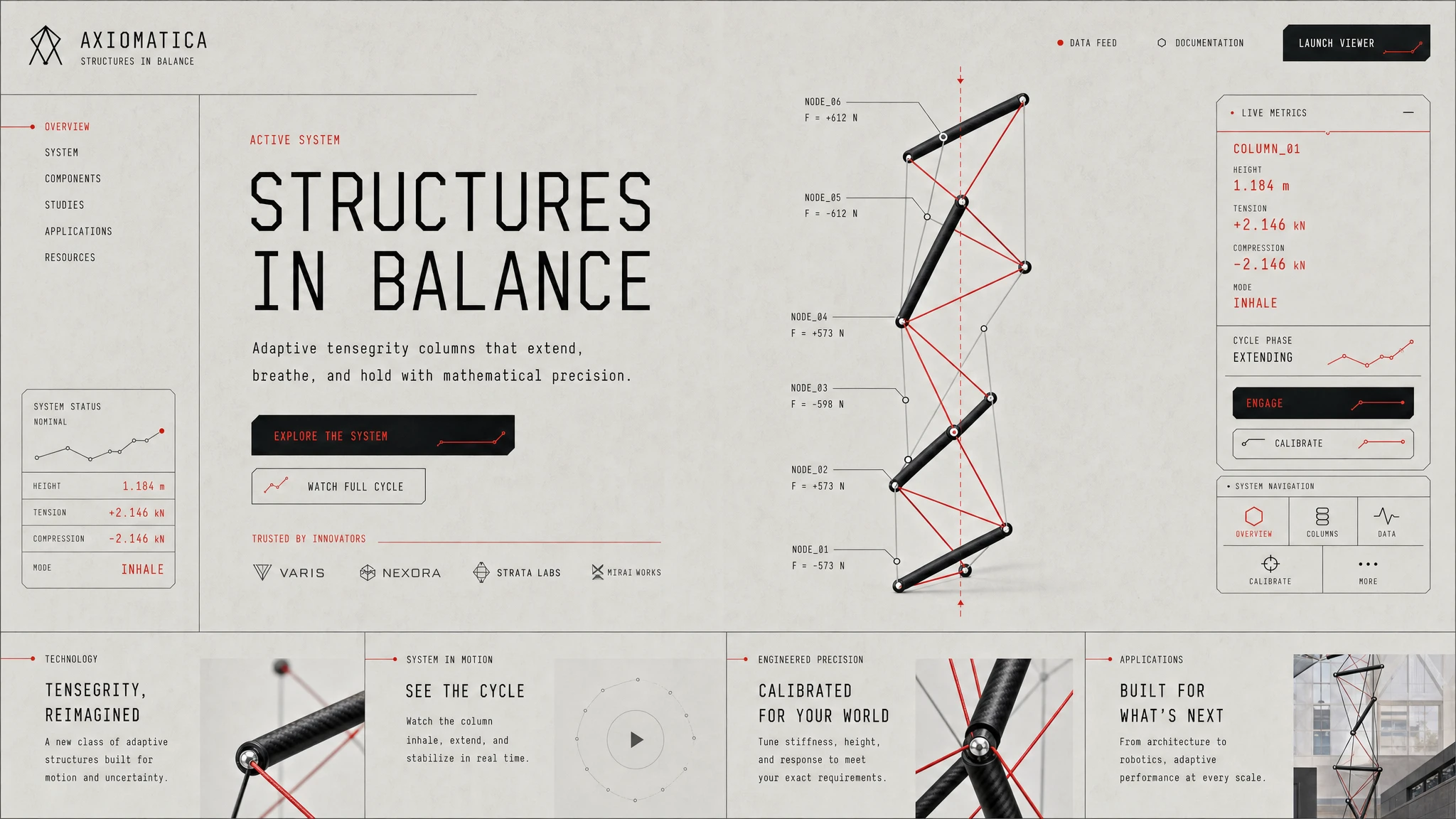 Tensegrity columnEngineering abstraction. A kept states written as line types: solid, dashed, red.